Step away from the bright and bold. Summer 2018 is all about achingly cool pastels that are bound to drive away the summer blues.
“Pastels for summer. Groundbreaking.” I can almost hear Meryl Streep’s Miranda Priestly shade me as I submit this story, but what can I do? There is a reason why florals come back on the racks and in the magazines every spring — the same applies to pastels in summer.
Certain creative slants are beyond trends; they are almost seasonal holy grails and every year, the pilgrimage is made. It is in the path you take, that collections and creative visions differentiate themselves from their predecessors.
Why do we gravitate towards pastels when temperatures hit their highs? Simple: they help us cool down. When it comes to all things lifestyle, pastels have shed their girlie associations to emerge as a unisex choice. For that, the entire colourway must thank gender-bending Millennial Pink.
In interiors, pastels hold court this summer by ways of layering that unique shade of blush with an entire new family of neutrals. From walls and floors to soft furnishings and accessories, here is how you nail the colour pastel.
EXPLORE THE FLOOR
Of course you can look at redoing your entire floor in blush pink carpets or new age terrazzo, but have you heard of Epoxy? This flooring compound garnered itself a bad reputation for its rather lackluster use in warehouses and garages, till it was rescued by interior designers looking for an industrial finish with an edge. Epoxy floors of today come in a wide gamut of colours — you can even customise them — and are easy to apply. Choose your favourite pastel shade, do a sample test and get started with a brand-new floor.
You can also look at investing in artisanal flooring tiles, which will lend a Moorish appeal to your interiors. UAE’s home-grown brand Mosaico offers handmade cement tiles that can be customised to your requirements. As no two tiles are ever identical, you will have a characterful floor. And if you still feel the need for a rug, it doesn’t matter if you favour a modern design or a classical one, as long as the colourways are light, fresh and almost washed out. I recently bought a rug that is on trend with the ‘eroded’ look — baby blues, seafoam greens and faded yellow make it very contemporary — but if I were to invest in another statement piece, it would be Illulian’s whimsical seashells design.
LOOK UP
Even I wouldn’t recommend painting the ceiling — I think white ceilings render a much coveted sense of height and volume — but why not explore lighting? Brands have already rolled out collections that have stepped away from metal and crystal, towards a more textural, warm stance. We have seen how innovation in materials — light-weight concrete and porcelain — were deployed over the past three years to great impact. From pleated designs and polished finishes to organic forms, designers have explored a new, softer approach to lighting. The trend also applies to their ultimate manifestation — the colour. Marset has remained ahead of the curve with its ever-evolving love affair with scale and the muted palette. Their lantern inspired Santorini collection is a 100 per cent on-trend.
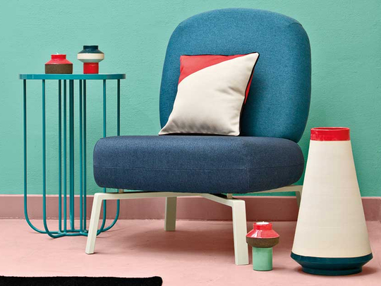
WHAT ABOUT THE REST?
This is where you layer. Given my recent experience at ‘cool’ coffee shops, I must insist that the route to a successful pastel palette that is not feminine lies in contrast. The key here, is to avoid the bright and brash. Instead, look for earthy colours like moss green, Persian blues, sandy browns or even a fifty shades of grey. Alternatively, you can experiment with pastel versions of your favourite bold colours for a double whammy. Ground the look with colour-blocked accessories and you are onto a winner. A word of caution — avoid metallic accents, especially yellow and rose gold, as they overcook the scheme.