Dubai – The Roads and Transport Authority (RTA) unveiled its new brand identity on Wednesday at a ceremony in Dubai.
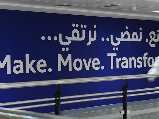
Based on the three core elements — make, move, transform — the new brand identity will be more about experiences than visuals, said Mattar Al Tayer, director-general and chairman of the Board of Executive Directors of RTA, as he made the announcement.
“The launch of the new corporate identity marks a beginning of a new era for excellence in implementing projects and initiatives that contribute to the realisation of the vision of His Highness Shaikh Mohammad Bin Rashid Al Maktoum [Vice-President and Prime Minister of the UAE and Ruler of Dubai] of making Dubai best in various fields worldwide. It also contributes to realising the strategic plan of the Dubai Government 2021 aimed at providing improved infrastructure and world-class services,” said Al Tayer.
The three core elements of the new brand — make, move, transform — stand for what RTA has done, is doing and will be doing. It reflects the constant change it brings about.
“Change is the secret underlying the success of organisations, and the corporate identity and logo depict the profile of every entity. RTA is one of the key entities leading the technological drive, and adopts new standards of innovation. It seeks to drive Dubai into the future and at the same time realise the ambitions of the leadership and needs of residents of the emirate besides supporting the change drive,” he added.
However, not everything is changing. The ubiquitous triangular logo of RTA will remain, so will the primary colour of red that stands for RTA.
“Our logo is not changing, because the logo has a strong visual presence as a brand. Red has been RTA’s primary colour, which will remain, in addition to blue. Red is an active colour and to balance it we have added blue, which stands for safety,” said Mouza Al Merri, director of Marketing and Corporate Communications at RTA.
She added that RTA’s mission and vision will remain the same, which is to provide safe and smooth transport for all and make people happy.
Interestingly, RTA is adding more colour to its image.
“RTA’s new brand image will also reflect a full-fledged colour palette that represent various positive emotions. RTA is a huge entity with a wide range of activities, so having a big colour palette is important,” she said.
The new brand will reflect a new typography and new iconography and new icons for different modes of transport.
“We want the new brand to give a feel of integration among different modes of transport. All services of RTA will gradually reflect the new branding and will have unified iconography for a more integrated experience,” she said.
The new identity and colours will reflect on the RTA’s website, mobile apps, signage as well on its customer service experience.
“It’s not just about the way things look but it’s the way things function. It will help simplify the experience of the end user, both online and offline,” said Al Merri.