Prints, patterns and textures are all the rage this year. The good thing about this movement is you don’t have to go in for a complete design overhaul to be on-trend. From a key wallpaper investment to a rug or a flock of plush cushions, you can update your home with as much as your wallet allows. This is your basic guide to help you get started.
The Commandments
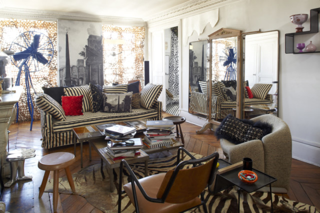
It’s easy to live a dull, plain life; but it’s the colours, prints and textures of our experiences that add value. The same applies (albeit not that heavily) to interiors. There is some method to the prints and patterns madness though. What you are looking for is a layered look — different patterns, colours and material put together to seem effortless. Follow these simple rules to banish boredom from your home forever.
The base colour
When you are playing with prints, pattern and designs, it is important you decide on which colour you’d like to play the hero. Once you know that, you will find many other colours — from the warm to cooler tones — which will complement your “hero” and give you a larger palette to work with. When in doubt, stick to classically proven colour palettes — blue and orange for example.
White and neutrals
For the less daring — or the classic lovers — these are your best friends. White forms the perfect backdrop to any colour and print, and neutral colours such as taupe, beiges and light greys allow big prints to breathe. The general rule is stick to one surface with the bold print — the floor (carpet) or walls (wallpaper/art) and then layer the look with smaller prints via cushions etc. Keep the key furniture piece neutral.
Size matters
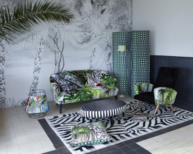
The scale of prints is important to help you achieve the layered look. Large scale patterns and small ones can exist in complete harmony as long as they come from the same colour range. Look to your feature artwork, your curtains or even the wallpaper and seek out the dominant print. From there look for prints that compliment it — in smaller size. The more varied your print scales, the more inviting the space will feel.
Be bold
Express yourself, your tastes and experiences through patterns and prints by showcasing your travel finds, prized possessions (think about framing your mother’s heirloom dress you’d dare not ruin) and enjoy the story in their prints and textures. Bold prints and strong colours are not for the faint-hearted — but you’re not one. You can easily mix multiple patterns by making sure the base colour is either the same or completely on the other end of the colour spectrum.
KNOW YOUR PRINTS
We give you four prints that are hot right now:
Chevron
If you can identify a Missoni print, you know what the Chevron print is. This geometric zig-zag, often best in two block colours has been a fashion and interiors staple for years, showing no signs of letting go. Carpets are the safest bet if you love this fashion staple print.
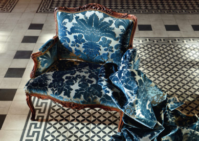
The damask
The Victorian print (and once you might associate with old country homes in Europe) has seen a revival in the last few years, getting its own update. From modest prints to velvet flocking, metallic overlays and crystals — from wallpaper to your bed linen, damask is here to stay. If the print still reminds you of your grandmother, invest in an occasion chair upholstered in a damask.
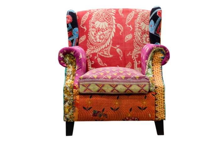
Paisley
This is your India inspiration moment. From henna designs to the beautiful jacquards, India’s love for the stylized tear-drop is well known. This season the paisley moves from your wardrobe to your prized crockery. Opt for a modern carpets — white prints on Indgo backgrounds are all the rage.
Houndstooth
This duotone textile pattern characterised by broken checks or abstract four-pointed shapes is back in vogue. Traditionally a gentleman’s fashion must-have, it’s been made iconic — in black and white — by the biggest fashion labels. Home collections are exploring contemporary colour palettes to great success.
THE HOTTEST LOOKS RIGHT NOW
Indian impact
India has been the muse of many interior designers for a while now and to be honest, we were over-saturated by the unapologetic extravagance the palette typically demands. In the past year though, the country has found favour again with artists; contemporary brands are taking typically Indian motifs such as jewellery patters and paisleys — in all their jewel tone glory — and applying them to crockery, home linen and accessories with restrain. To nail the look, keep the overall scheme simple and invest in plain pieces that echo the colour palette in your India-loving pieces.
Mediterranean
Let the memories of Morocco and Spain be your inspiration. From classic, oversized and overdesigned florals to miniature petals and buds, the classic floors of the Mediterranean region have inspired this season’s most coveted tile collections. From subtle blues to high impact reds, blues and yellows, Moorish tiles are the easiest way to add some pizazz to any space in your home.
A statement spalshback in your kitchen or an accent wall in the bath are the easiest options, but if you dare, floor your foyer with these dramatic tiles in a hexagonal pattern. You will not anything else.
Boho-Chic
Say goodbye to matchy-matchy with this look that takes (hopefully) the best of all cultures and eras into one effortlessly put together look. The key here is not the number of pieces you choose, but your own confidence in your choices. If you love the pieces, they will find their place in your scheme, but the over-arching rule to get this look right is to anchor it with a strong focal furniture piece — a dining table or a sofa — in a neutral colour.