Each year, trend forecasters, design gurus and industry specialists share their views on what they feel will be the hottest, biggest, most coveted design movements.
In addition to studying emerging directions in the creative industries, research into fields as diverse as climate change, the state of our economy, our shifting conscience, politics, even changing habits of consumption and social interaction empowers forecasters to predict what would align with our evolving state of mind.
Pantone proclaimed Green, and a ‘nature inspiration’ as its go-to palette for the year. Fresh and exciting as it may be, life in the desert eventually demands a cool, soothing embrace. This is our edit of the most chic colours for desert dwelling.
“We are all inspired by different things. We travel, physically or online, and discover new places. The food we eat, the books we read and the music we listen to come from all corners of the world,” says Lisbeth Larsen, global colour and creative director at Jotun, the paints brand. “With these new colour cards we wish to reflect this curiosity in people’s homes. The three themes we present for the year capture these tendencies in time”.
While promoting a forward-thinking and progressive approach to colour globally, these palettes find particular relevance in the Middle East, where we celebrate the diversity in our communities and a sense of curiosity abounds. The soothing tone of the 2017 colour range is the perfect balm to our highly stimulated minds and arid climes.
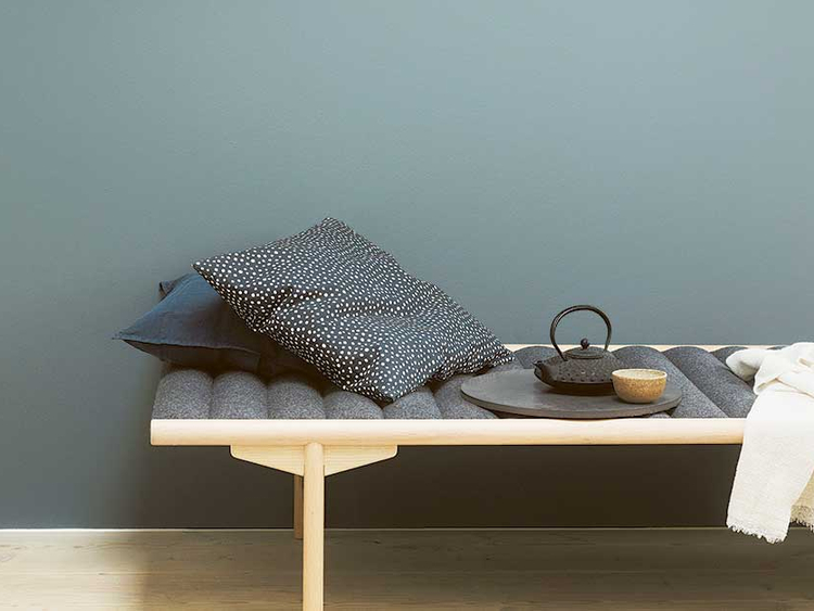
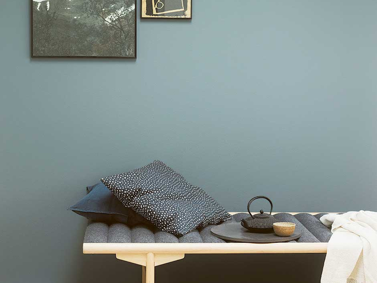
NORDIC STYLE

Dusty Blues from the Nordic Palette make for timeless, relaxed chic.
Renowned for its simplicity, nature inspiration and understated elegance, this trend centres on functionality and flawless craftsmanship to create stimulating sensory elements that engage, without overpowering. Inspired by the Nordic people’s eco-friendly mind-set and earthy living, this theme features a beautiful, timeless and pared down palette of soft blue hues, blended with sandy shades to best recreate nature’s relaxing atmosphere.
Arctic greys, linen and stone hues create a minimalistic backdrop for delicate Scandinavian design pieces, handmade ceramics, wicker and textiles in pure wool and linen. The result is a home where our busy everyday life seems to move a bit slower. And just as the sky is an important element of the Nordic nature, so is the ceiling inside.
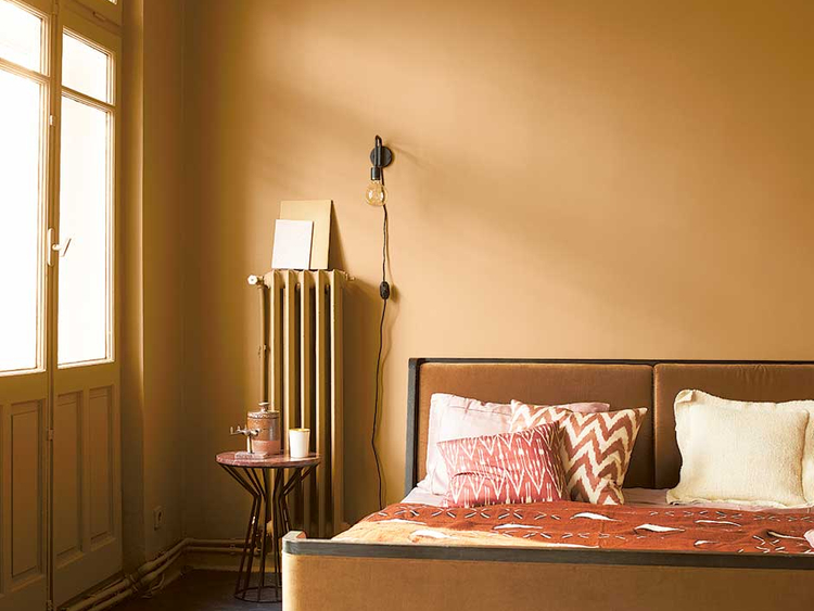
CONTINENTAL HOME

Invite the desert in with Mustard yellows from the Continental colour range.
This palette lends instant warmth and familiarity to the home. Providing the perfect backdrop a lifetime of travel finds, prized possessions and impulse buys, this palette can effectively embrace a wide selection of design pieces, across varied styles and themes. The hues proposed in this colour range lend texture and depth to the space.
The warm palette made of burnt reds, terracotta, dusty purples and mustard yellows works beautifully with vintage bargains, metal and stone sculptures and mid-century furniture. Mix and match different hues in one room, or add beiges and neutrals for a restrained look.
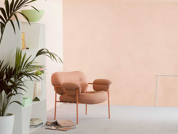
URBAN LIVING

The Urban Living palette is the perfect antidote to hectic modern living.
Inspired by life in technology hotspots such as Tokyo and San Francisco, this colour range is for the creative homeowners who are modern, playful and chic. This palette seeks to imbue modern living with calm and subtlety – the perfect antidote to hectic modern living.
Seek decidedly muted or pastel shades of cool colours like pink, brown and delicate greens. A touch of white will further the quest for serenity at home. Used as a feature on accent walls or the entire room, these colours promise not to overwhelm. If you can’t give up on interior drama, add a velvety grey. Accessorise with lush plants, sculptural art and design pieces to achieve a look that is both sophisticated and organic.