I’m not sure about you, but I’ve had my fill of 50 shades of serenity, moss green and inky blues. What I am after, is a clean, crisp, timeless palette that will grow with me, and more importantly, something I wouldn’t grow out of in a hurry.
This past week, international paint and colour expert Hellen Mullet of the paints superbrand Benjamin Moore was in town to unveil their Colour of the Year 2016. I was expecting an unusual shade, some marketing smoke and mirrors as one expects with such revelations, but what she presented honed in what, I feel, we as a community are working towards — simplicity, authenticity, familiarity. And within that framework, enough opportunity to express our individuality.
Simply White, Benjamin Moore’s colour of choice for the year is unexpected and obvious at the same time. “The colour white is transcendent, powerful and polarising”, says Ellen O’Neill, Creative Director, who brings to the company years of fashion industry experience. “From weathered wainscot to crisp canvas shades, we found white present, like the proverbial red thread, tying diverse creative fields — fashion, product, interior, even automotive and food — it was time we celebrated and obsessed over this humble tone that is often taken for granted.”
The biggest issue with white is, it can be very clinical. “There is a white for every occasion, and some businesses require whites with blue undertones for a clinical look”, says Mullet. “When we research colours, we look at them from the perspective of a home. We’ve found whites with yellow undertones lend warmth.”
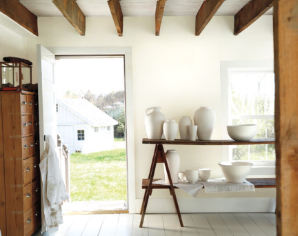
White can also hide a multitude of sins in your base-build, which, let’s be very honest, in this region can come in odd shapes, proportions, or at the very basic level, poor construction quality. “White is virtually limitless and can also show-off a smaller room, entrance, feature area, or even a ceiling”, says Mullet. “When used in a small room, the colour white and the sheen of the paint can be used to create a room that is light, bright and exudes subtle beauty.” It is also the perfect way to celebrate historic architectural details of your property like wooden beams, Victorian trims and archways.
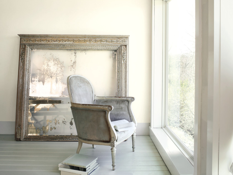
In our region with year-round sunshine, clean whites can be so much more vibrant and versatile. It can enhance natural light if used close to, or opposite the window, and also create soothing places to unwind when used with other warm shades. However, if you feel your space is particularly dark, white is a wonderful choice and can be used with strong accent colours, or even black, to create a space that reflects light and creates an alternative focal point to divert attention.
While Benjamin Moore has proposed over 250 whites to choose from, the secret to your perfect White is preparation of the surface you plan to anoint with the pristine colour. Make sure the surface is perfectly in plumb, level and immaculately even, because as soft as white is, it can also be extremely unforgiving to bad prep. Ask your painting contractor to smooth, level, and if needed, tape the walls, and then apply primer coats to get the perfect surface for your favourite White.
Unlike bold colours that can instantly fill up a space, it takes effort to make white work. Layering of materials, finishes, shapes, tonalities, even design styles may take more time and thought, but it delivers on the promise of timeless chic. “People sometimes think White is too staid, too boring. White plays with shapes, materials, light and shadows to create the most transformative spaces” says Mullet.
I agree.